Component Catalog
Visual reference for all UI components in the design system.
Source: src/components/ui/
Quick Reference
UI Components
| Component | Variants | Sizes | Use Case |
|---|---|---|---|
| Button | primary, secondary, destructive, ghost, outline | sm, md, lg, icon | Actions and navigation |
| Input | default, error | - | Form text input |
| Card | - | - | Content containers |
| Alert | default, success, warning, error | - | Status messages |
| Badge | default, secondary, destructive, outline | - | Status labels |
| PasswordStrengthMeter | - | - | Password validation |
| FieldError | - | - | Form validation errors |
SDK Components
| Component | Use Case | Package |
|---|---|---|
| ProtectedRoute | Protect pages from unauthenticated users | @soclestack/react |
| Can | Role-based UI visibility | @soclestack/react |
| OrganizationSwitcher | Multi-tenant org switching | @soclestack/react |
| InviteAccept | Handle invite tokens | @soclestack/react |
| SessionTimeoutWarning | Warn before session expires | @soclestack/react |
| LoadingSpinner | Loading indicator | @soclestack/react |
| AccessDenied | Access denied page | @soclestack/react |
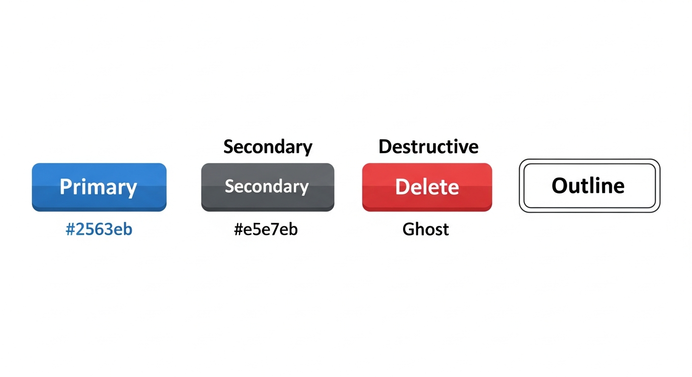
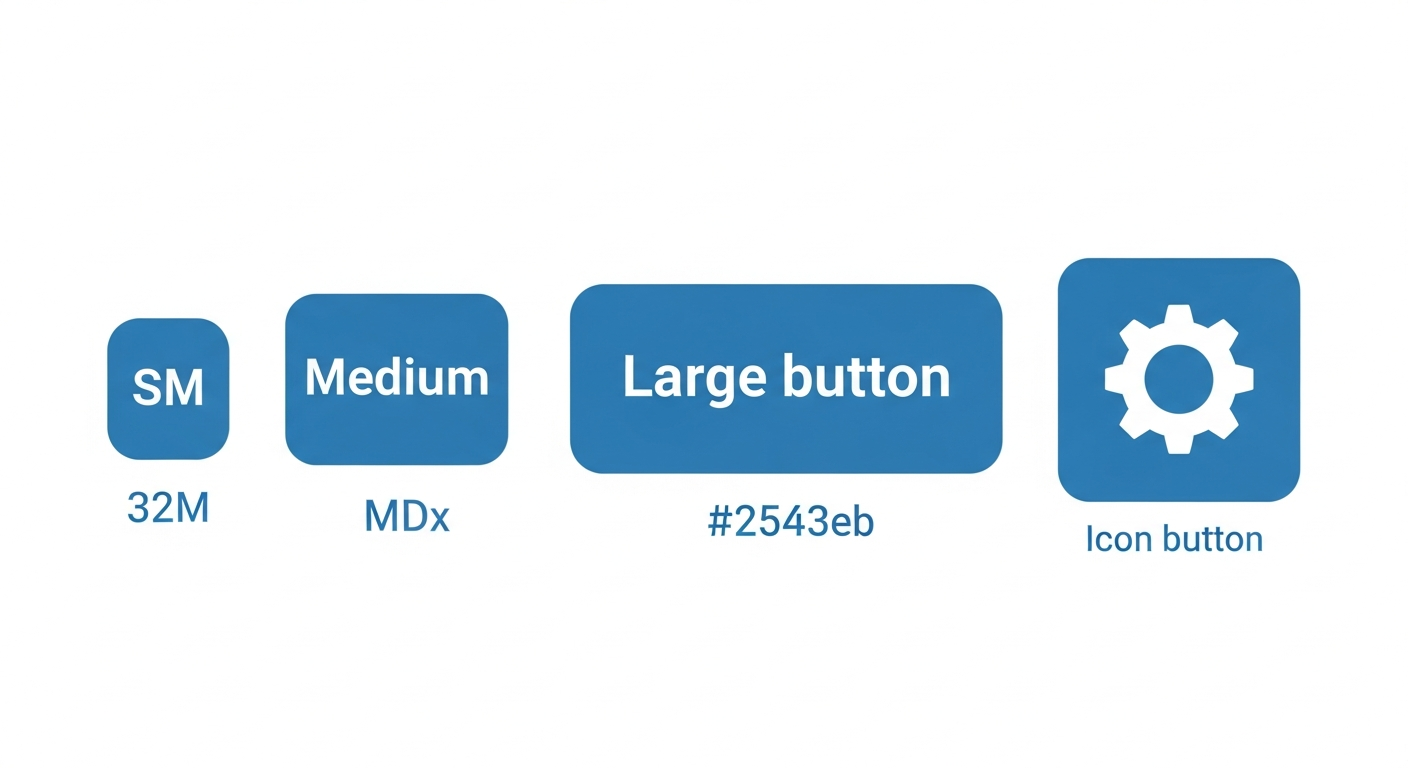
Button
Versatile button component for actions and navigation.
When to use:
primary: Main action on page (Submit, Save, Confirm)secondary: Cancel, Back, or less important actionsdestructive: Delete, Remove, or irreversible actionsghost: Subtle actions, toolbar buttons, or icon-only buttonsoutline: Alternative to secondary when more visual weight is needed
Props
| Prop | Type | Default | Description |
|---|---|---|---|
variant | 'primary' | 'secondary' | 'destructive' | 'ghost' | 'outline' | 'primary' | Visual style |
size | 'sm' | 'md' | 'lg' | 'icon' | 'md' | Button size |
disabled | boolean | false | Disabled state |
className | string | - | Additional CSS classes |
Variants
Sizes
Usage
import { Button } from '@/components/ui/button';

// Primary action
<Button onClick={handleSubmit}>Save Changes</Button>

// Secondary action
<Button variant="secondary">Cancel</Button>

// Destructive action
<Button variant="destructive">Delete Account</Button>

// Icon button
<Button variant="ghost" size="icon">
  <Settings className="h-4 w-4" />
</Button>

// Loading state
<Button disabled>
  <Loader className="mr-2 h-4 w-4 animate-spin" />
  Saving...
</Button>
Accessibility
- Focus ring visible on keyboard navigation
- Disabled state prevents interaction and shows visual feedback
- Supports
aria-labelfor icon-only buttons
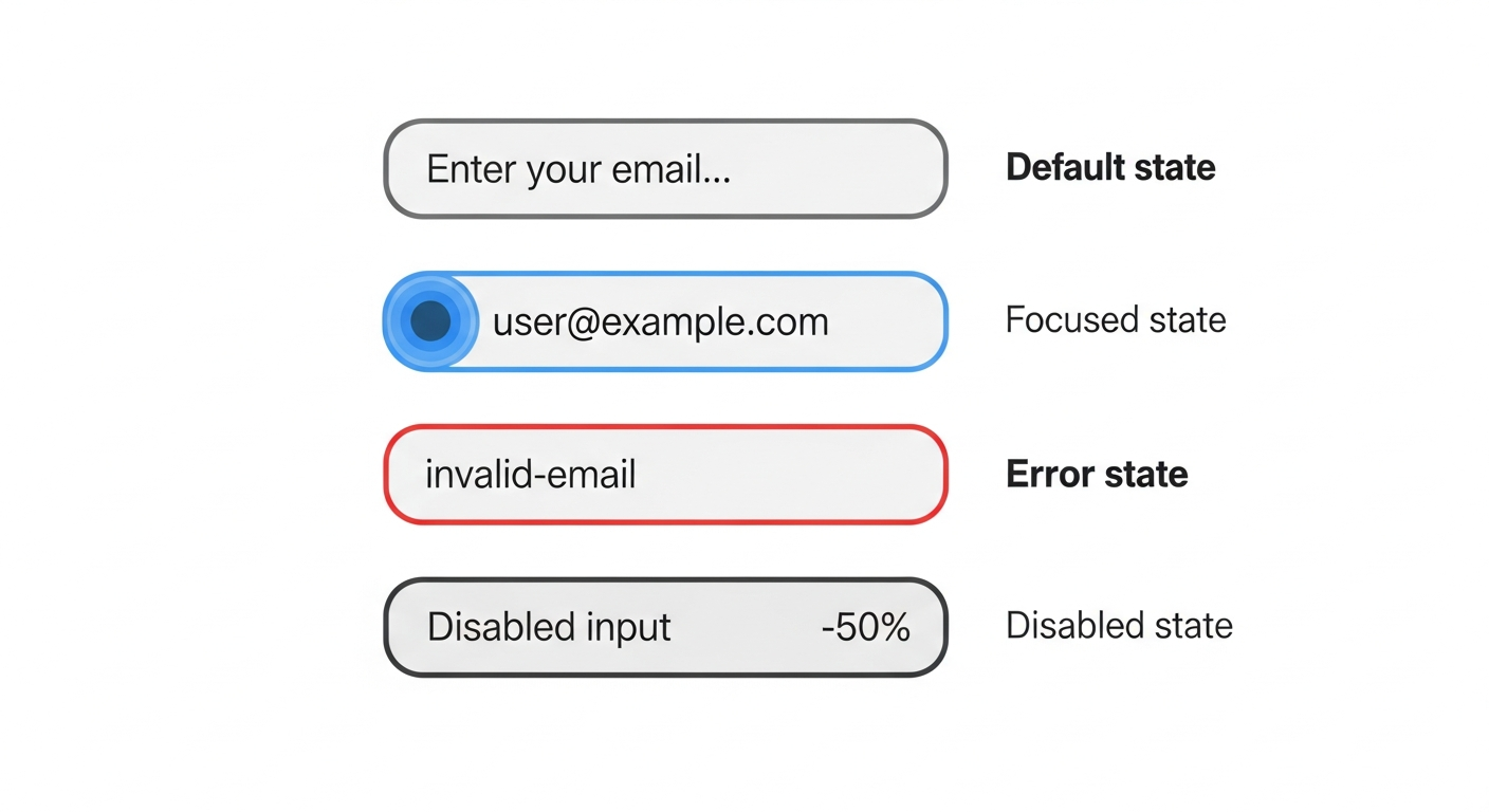
Input
Form input component with error state support.
Props
| Prop | Type | Default | Description |
|---|---|---|---|
error | boolean | false | Shows error styling |
type | string | 'text' | Input type (text, email, password, etc.) |
placeholder | string | - | Placeholder text |
disabled | boolean | false | Disabled state |
States
Usage
import { Input } from '@/components/ui/input';

// Basic input
<Input
  type="email"
  placeholder="Enter your email"
  value={email}
  onChange={(e) => setEmail(e.target.value)}
/>

// With error state
<Input
  type="password"
  error={!!errors.password}
  aria-describedby="password-error"
/>

// Disabled
<Input disabled value="Cannot edit" />
Accessibility
- Supports
aria-invalid(auto-set whenerroris true) - Use
aria-describedbyto link to error messages - Focus states clearly visible
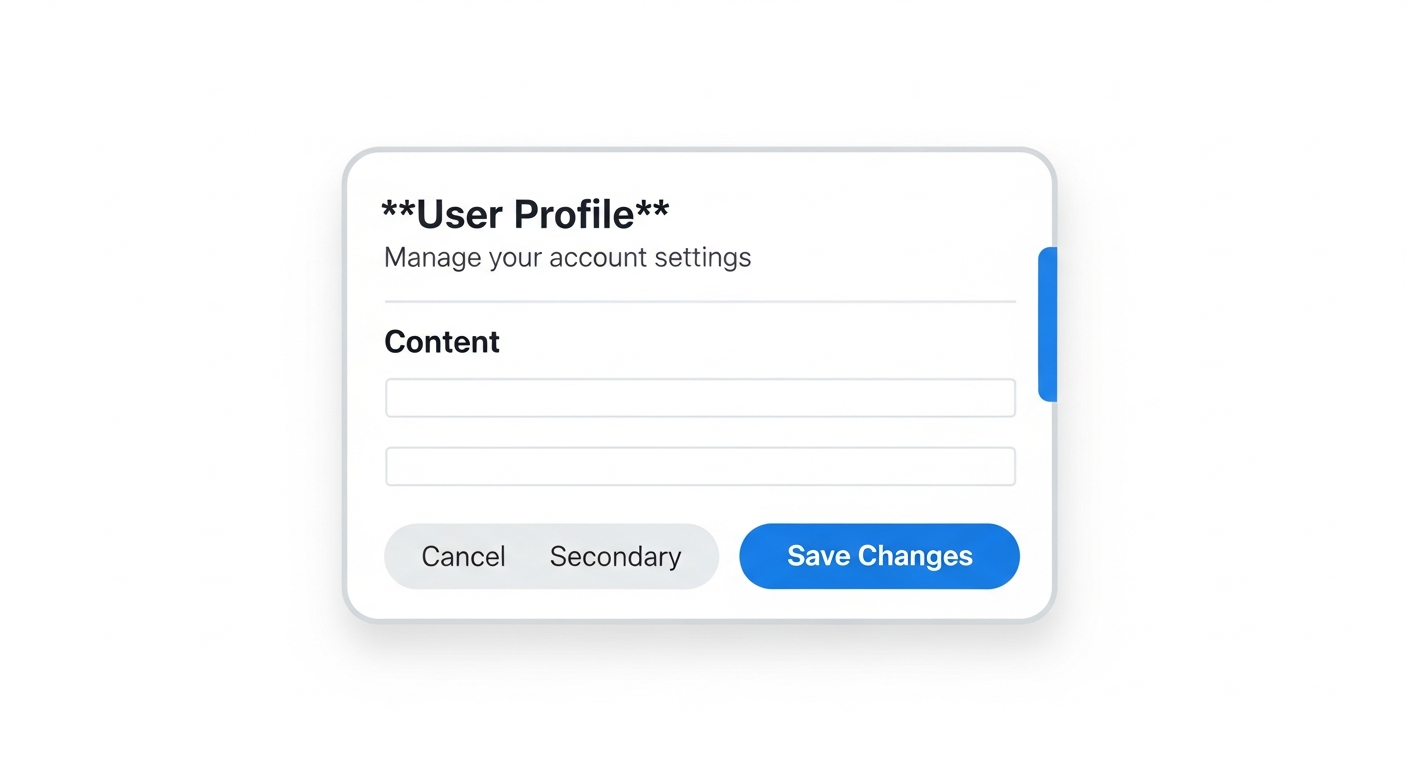
Card
Container component for grouped content with header/body structure.
Sub-components
| Component | Purpose |
|---|---|
Card | Outer container with border and shadow |
CardHeader | Header section with spacing |
CardTitle | Main heading (h3) |
CardDescription | Subtitle text |
CardContent | Main content area |
CardFooter | Footer with actions |
Structure
Usage
import {
  Card,
  CardContent,
  CardDescription,
  CardFooter,
  CardHeader,
  CardTitle,
} from '@/components/ui/card';

<Card>
  <CardHeader>
    <CardTitle>Account Settings</CardTitle>
    <CardDescription>Update your profile information</CardDescription>
  </CardHeader>
  <CardContent>
    <form>
      <Input placeholder="Name" />
      <Input placeholder="Email" />
    </form>
  </CardContent>
  <CardFooter>
    <Button variant="secondary">Cancel</Button>
    <Button>Save</Button>
  </CardFooter>
</Card>
Alert
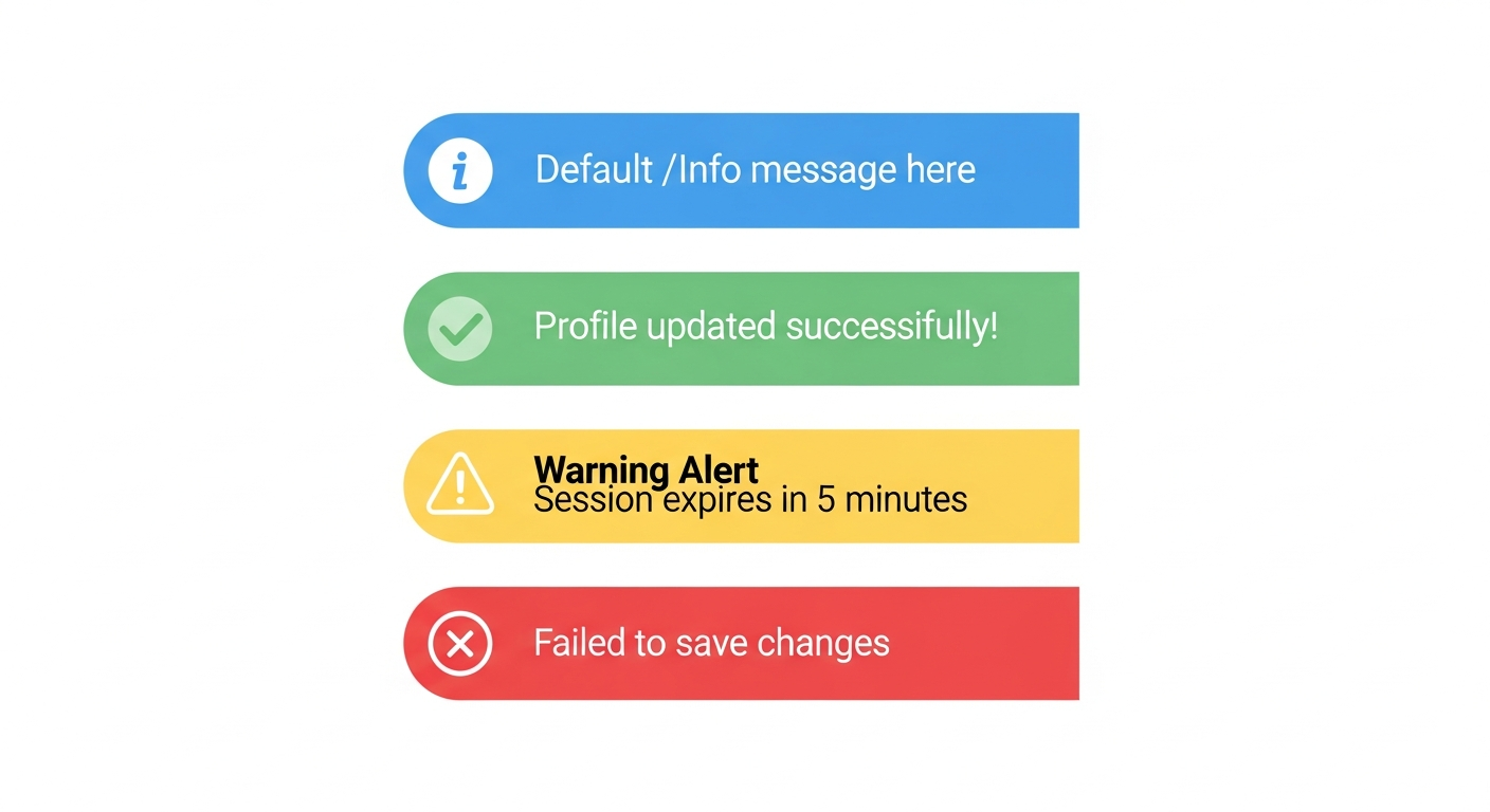
Status message component with icon and color variants.
When to use:
default: General information, tips, or neutral messagessuccess: Confirmation of completed actionswarning: Caution about potential issues or expiring stateserror: Failed actions or validation errors requiring attention
Props
| Prop | Type | Default | Description |
|---|---|---|---|
variant | 'default' | 'success' | 'warning' | 'error' | 'default' | Alert type |
children | ReactNode | - | Alert content |
Variants
Usage
import { Alert } from '@/components/ui/alert';

// Success message
<Alert variant="success">
  Your password has been changed successfully.
</Alert>

// Error message
<Alert variant="error">
  Invalid credentials. Please try again.
</Alert>

// Warning
<Alert variant="warning">
  Your account will be locked after 3 more failed attempts.
</Alert>

// Information
<Alert variant="default">
  Two-factor authentication is recommended.
</Alert>
Accessibility
- Uses
role="alert"for error/warning variants - Uses
aria-live="assertive"for errors,aria-live="polite"for others - Icons are decorative (
aria-hidden="true")
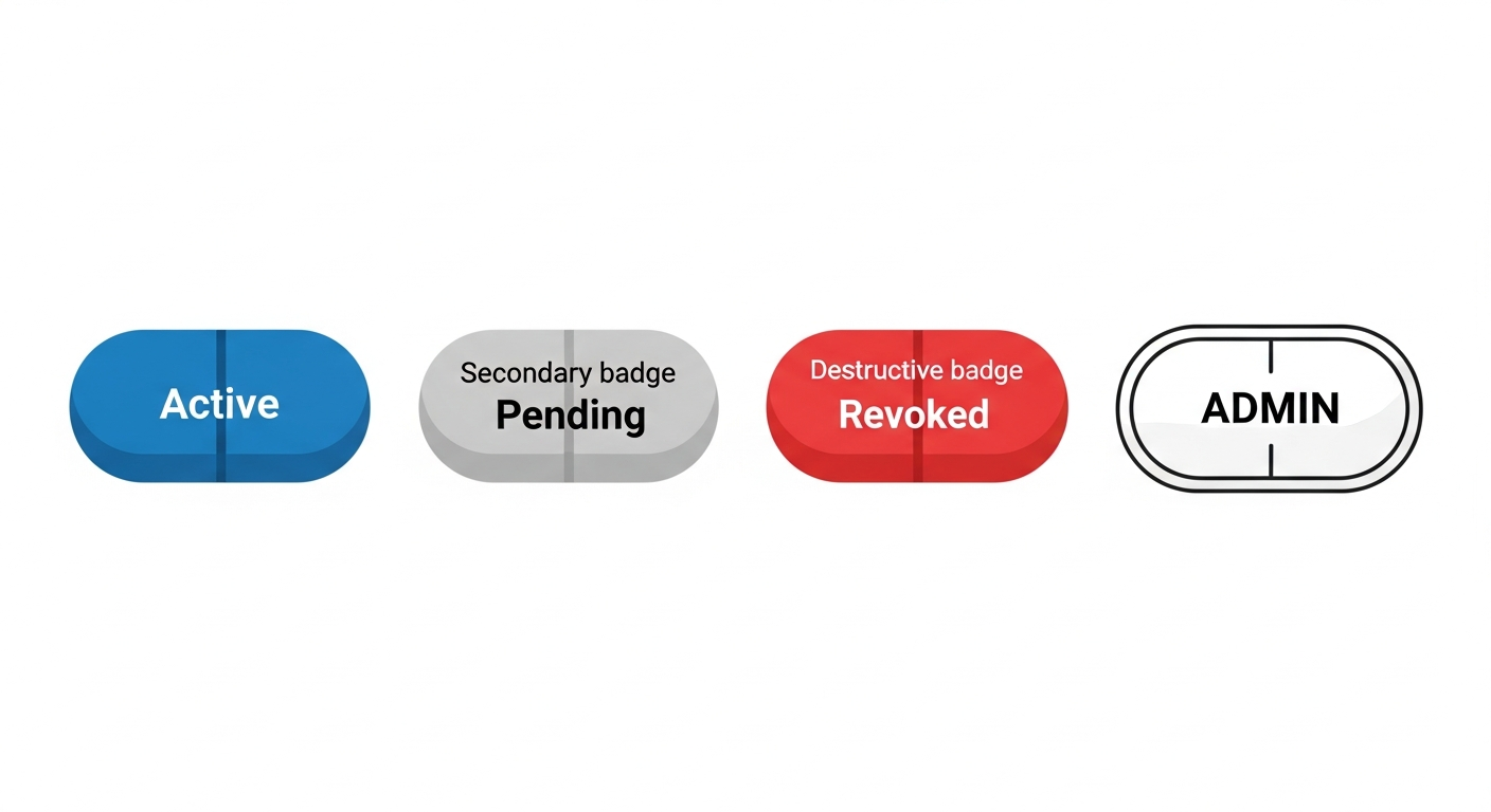
Badge
Small status indicator labels.
When to use:
default: Active or positive states (Active, Enabled, Online)secondary: Neutral or pending states (Pending, Draft, Idle)destructive: Negative states (Expired, Revoked, Inactive)outline: Labels or categories (role badges, tags)
Props
| Prop | Type | Default | Description |
|---|---|---|---|
variant | 'default' | 'secondary' | 'destructive' | 'outline' | 'default' | Badge style |
Variants
Usage
import { Badge } from '@/components/ui/badge';
// Status indicators
<Badge>Active</Badge>
<Badge variant="secondary">Pending</Badge>
<Badge variant="destructive">Expired</Badge>
// Role badges
<Badge variant="outline">{user.role}</Badge>
// In tables
<td>
<Badge variant={key.revokedAt ? 'destructive' : 'default'}>
{key.revokedAt ? 'Revoked' : 'Active'}
</Badge>
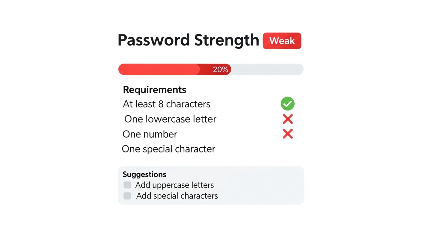
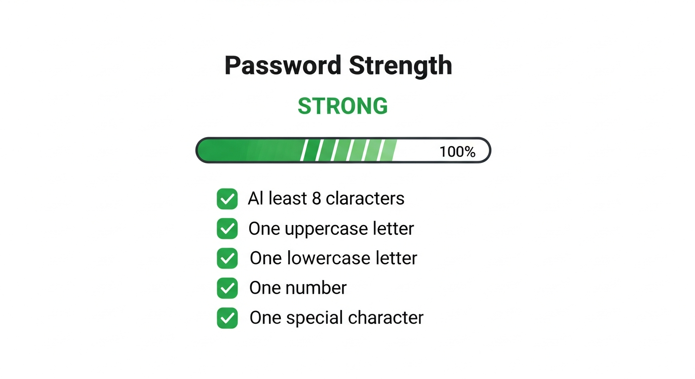
</td>PasswordStrengthMeter
Visual password strength indicator with requirements checklist.
Props
| Prop | Type | Default | Description |
|---|---|---|---|
password | string | - | Password to evaluate |
showRequirements | boolean | true | Show requirements checklist |
showSuggestions | boolean | true | Show improvement suggestions |
Visual States
Weak Password:
Strong Password:
Usage
import { PasswordStrengthMeter } from '@/components/ui/password-strength-meter';

// Full display
<PasswordStrengthMeter password={password} />

// Minimal (just the bar)
<PasswordStrengthMeter
  password={password}
  showRequirements={false}
  showSuggestions={false}
/>
FieldError
Form field error message display.
Props
| Prop | Type | Default | Description |
|---|---|---|---|
id | string | - | ID for aria-describedby linking |
error | string[] | - | Array of error messages (displays first) |
Usage
import { FieldError } from '@/components/ui/field-error';

<div>
  <label htmlFor="email">Email</label>
  <Input
    id="email"
    error={!!errors.email}
    aria-describedby="email-error"
  />
  <FieldError id="email-error" error={errors.email} />
</div>
Accessibility
- Uses
role="alert"for screen reader announcement - Uses
aria-atomic="true"to announce entire message
Design Tokens
Colors
| Token | Hex | Usage |
|---|---|---|
| Primary | #2563eb (blue-600) | Primary actions |
| Secondary | #e5e7eb (gray-200) | Secondary actions |
| Destructive | #dc2626 (red-600) | Destructive actions |
| Success | #16a34a (green-600) | Success states |
| Warning | #ca8a04 (yellow-600) | Warning states |
| Error | #dc2626 (red-600) | Error states |
Spacing
| Size | Value | Usage |
|---|---|---|
| sm | h-8, px-3 | Compact buttons |
| md | h-10, px-4 | Default size |
| lg | h-12, px-6 | Large buttons |
Border Radius
All components use rounded-md (0.375rem / 6px) for consistency. Badges use rounded-full for pill shape.
SDK Components
Components from @soclestack/react for common authentication patterns.
ProtectedRoute
Protects routes from unauthenticated users with optional role requirements.
Props:
| Prop | Type | Default | Description |
|---|---|---|---|
children | ReactNode | required | Content to protect |
roles | string[] | - | Required roles (any match) |
fallback | ReactNode | <LoadingSpinner /> | Loading state |
accessDeniedFallback | ReactNode | <AccessDenied /> | Role check failed |
import { ProtectedRoute } from '@soclestack/react';

// Basic protection
<ProtectedRoute>
  <Dashboard />
</ProtectedRoute>

// With role requirement
<ProtectedRoute roles={['ROLE_ADMIN']}>
  <AdminPanel />
</ProtectedRoute>
Can
Conditionally renders children based on user roles or organization permissions.
Props:
| Prop | Type | Default | Description |
|---|---|---|---|
children | ReactNode | required | Content to show if authorized |
roles | string[] | - | Global user roles |
orgRoles | string[] | - | Organization roles |
fallback | ReactNode | null | Content if unauthorized |
import { Can } from '@soclestack/react';

// Show only to admins
<Can roles={['ROLE_ADMIN']}>
  <DeleteButton />
</Can>

// With fallback
<Can roles={['ROLE_ADMIN']} fallback={<UpgradePrompt />}>
  <PremiumFeature />
</Can>

// Organization roles
<Can orgRoles={['ROLE_OWNER', 'ROLE_ADMIN']}>
  <TeamSettings />
</Can>
OrganizationSwitcher
Dropdown for switching between organizations in multi-tenant apps.
Props:
| Prop | Type | Default | Description |
|---|---|---|---|
trigger | ReactNode | Default button | Custom trigger element |
onSwitch | (org: Organization) => void | - | Called after switching |
showCreateLink | boolean | false | Show create org link |
createOrgUrl | string | /organizations/new | URL for create link |
import { OrganizationSwitcher } from '@soclestack/react';

// Basic usage
<OrganizationSwitcher />

// With callback
<OrganizationSwitcher
  onSwitch={(org) => router.push(`/org/${org.slug}`)}
  showCreateLink
/>
InviteAccept
Handles organization invite token validation and acceptance.
Props:
| Prop | Type | Default | Description |
|---|---|---|---|
token | string | required | Invite token from URL |
onAccepted | (org: Organization) => void | - | Called after accepting |
onError | (error: Error) => void | - | Called on error |
loginUrl | string | /login | Login page URL |
returnUrl | string | - | Post-login redirect |
States:
| Status | Visual |
|---|---|
loading | Spinner |
valid | Invite details + Accept button |
expired | Error message |
invalid | Error message |
import { InviteAccept } from '@soclestack/react';

<InviteAccept
  token={params.token}
  onAccepted={(org) => router.push(`/org/${org.slug}`)}
  onError={(error) => toast.error(error.message)}
/>
SessionTimeoutWarning
Modal that warns users before their session expires.
Props:
| Prop | Type | Default | Description |
|---|---|---|---|
warnBefore | number | 300 | Seconds before expiry to warn |
checkInterval | number | 30 | Check frequency (seconds) |
onWarning | () => void | - | Called when warning shown |
onTimeout | () => void | - | Called when session expires |
onExtend | () => void | - | Called after extend success |
onLogout | () => void | - | Called on logout click |
title | string | "Session Expiring" | Modal title |
extendLabel | string | "Stay Signed In" | Extend button text |
logoutLabel | string | "Log Out" | Logout button text |
import { SessionTimeoutWarning } from '@soclestack/react';

// Basic - add to root layout
<SessionTimeoutWarning />

// With callbacks
<SessionTimeoutWarning
  warnBefore={300}
  onTimeout={() => router.push('/login?expired=true')}
  onExtend={() => toast.success('Session extended')}
/>
LoadingSpinner
Default loading indicator used by SDK components.
Props:
| Prop | Type | Default | Description |
|---|---|---|---|
size | number | 24 | Size in pixels |
className | string | - | Additional CSS |
import { LoadingSpinner } from '@soclestack/react';

<LoadingSpinner />
<LoadingSpinner size={32} className="text-blue-500" />
AccessDenied
Default access denied page shown by ProtectedRoute.
Props:
| Prop | Type | Default | Description |
|---|---|---|---|
title | string | "Access Denied" | Heading |
message | string | (default) | Description text |
import { AccessDenied } from '@soclestack/react';

<AccessDenied
  title="Permission Required"
  message="You need admin access to view this page."
/>